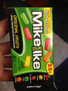
This
design shows a combination of a limited palette and contrasting values. Using
mainly the color green with a touch of silver makes this design a successful
limited palette. It also shows contrasting values within the photo used for the
design presenting interest.
This
design mainly establishes contrasting hues. The orange causes the blue to pop
and be noticed
This design shows harmonious chroma,
dominance in hue, and dominance in chroma. The harmonious chroma is shown by
how intense all the coloring is. Nothing is faded or grey. The Dominant hue is
purple making some hints of pink really stand out. Dominance in chroma is shown
by how it is predominately all similar chroma
This design shows transitions in hues, value, and chroma, harmonious
hues, and harmonious chroma. The transition in hues and harmonious hues is
shown by the use of all warm familied hues. The value and chroma varies
throughout the design.
This design can be an example of the use of neutrals, transitions in
value and transitions in chroma. The value moves throughout this design leading
your eye comfortably across
This design shows contrasting hues, contrasting chroma,
dominance in chroma. Your eye immediately moves towards the center to the blue
making the blue a very dominant hue. You comfortably move your eye down from
the contrast in chroma.where the information is held.
This contrast in
chroma, dominance in chroma, transition in hue
This design shows contrast in value, contrast in chroma, and dominance
in hue. The difference between the light and dark values in orange show the
contrast in value and chroma. The design is dominantly orange giving it a
dominant hue.
Everything in this design is bright and stands out making it
contain Harmonious Chroma.
The use of all primary colors in the same hue makes this
show contrasting hues and harmonious chroma. I think this design would have
looked better with some different use of chroma and value.
This design shows Harmonious hues and harmonious chroma given everything
is in the warm family just containing different values of it.
This design shows Transition in hues, transition in chroma,
transition in value and dominance in hue. The design is decidedly blue but goes
through nearly all the transitions of blue whether it value, or chroma,
the bright pink and the soft blue makes this design show contrast in
chroma, and softened chroma.
The use of all primary colors in this design and their intensity shows harmonious
chroma, and contrasting hues.
this design shows softened chroma giving it harmonious chroma as well as
harmonious hues.
this design shows harmonious chroma given how
everything is at the same intensity as well as contrasting hue and dominance in
hue. It is dominantly red even though the green stands out at first.
The transition in hue is shown by the transistion of red to yellow all
at similar intensity showing harmonious chroma. The blue causes contrasting
hues.
The use of only green in this design makes
this an example of imited Palette.
This design shows dominance in hue, use of nuetrals, contrasting chroma,
and contrasting value. There is much contrast between the light and dark
chromas and hues causing one to be ultimately dominant.
This design shows Contrasting
hues, contrasting chroma, and contrasting values. The different value and
shades of chroma can be shown within the blue hue as the contrasting hues can
be noticed by the black and yellow.
This design shows Contrasting
values, and transtition in value. The major changes between the light and dark
value can create movement and balance.
This
Design shows contrast in hue, contrast in chroma, and harmony in hues. In one
part of the design everything is contrasting compared to another section where
the hues are predominantly warm. The stripes somewhat vary in chroma.
This
design is a great example of transition in chroma. It can also be an example of
weak chroma.
This design shows transition in hue, limited
palette, and contrast in chroma. The
chroma changes drastically in this design. But the color green is dominant.
This design was taken while a red lamp was by creating a key in the
color.
This design is an example of the use of neutrals and the unity they
create.
In this design there is an example of contrasting values and
how movement is created between them.


