Friday, March 6, 2015

beginning mock up ideas


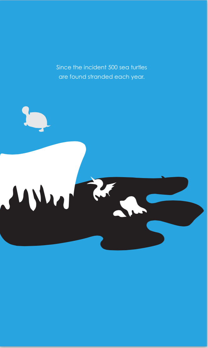
 So this is a foldable idea where the information can be discovered through an interactive paper display of unfolding a narrative of the oil spill. When removing each "character" piece form the "oil" you are presented with a fact or piece of information about the event. The beginning presentation of the foldable, if pursued, will be held together by a removable magnet mirroring the positive space represented in the poster it is correlated with.


This next piece is a pop up book idea where the book would be displayed next to the poster providing 
a fun surprising way of presenting additional informationabout the product.


This next presentation of information would be presented in a digital format on a an interactive device next to the poster. This is mocked up approach at creating the feel of an informational app correlating with the design style of the original poster. 


if environment were chosen


If people were chosen


If economy were chosen


Thursday, March 5, 2015

Bruce Mau Incomplete Manifesto

1. Allow events to change you.You have to be willing to grow. Growth is different from something that happens to you.You produce it.You live it.The prerequisites for growth: the openness to experience events and the willingness to be changed by them.
12. Keep moving. The market and its operations have a tendency to reinforce success.Resist it.Allow failure and migration to be part of your practice.

Bruce Mau is a Canadian designer who from 1985-2010 was the creative director for Bruce Mau Design and is the founder of the institute without boundaries. Mau studied at the Ontario College of Art & Design in Toronto but joined the Fifty Fingers design group before graduation. He helped found Public Good Design and Communications then later established Zone ½. Throughout his career he has been a cullinan professor, an advisor, a visiting scholar, and honorary fellow of the Ontario college of Art & Design and a member of the Royal Canadian Academy of Arts, among many other things. Bruce Mau applies to our class today with his produced 43 point program called an Incomplete Manifesto for Growth that attemps to help designers and other creative to reflect on their design process.

I personally connected the most with “Allow events to change you” and “keep moving” . I found these to be particularly inspirational because I like the idea of change and growth, especially as I become more established as a designer. I like the idea to keep in mind the openness needed to experience the events that will change me and help me grow further into what I am capable of. “Keep moving” spoke to me because there can just be so much on my plate and sometimes I just need to remind myself not be frozen with overwhelment. The overwhelmed feeling will pass I just have to stay motivated and keep moving.

Chip Kidd Reflections

Chip Kidd on Designing Books

            I found this Ted Talk very entertaining and informational on how the professional design process works. I actually really appreciated the fact he used a book design example that ended up being rejected. I thought the talk itself was wrapped up in a hilarious way by showing the alternate book cover, not designed by him that ultimately gets chosen. It was somewhat inspirational hearing a rejection story from such a well known and respected designer

“Designing Books is no Laughing matter. Ok, it is”


            I found this talk very inspiring and perfect for starting this book project. I loved hearing about his approach to solving the visual problem of the book cover. He talked about the value of intrigue and salesmanship when it came to designing a cover as well as the importance of insight to the story itself and making sure every decision is relevant to the story and the genre of book. I also enjoyed how he encorporates the entire book jacket into his design and thinks how the spine and back are effected just as much as the front. He takes on a responsibility when designing a jacket and understands the aspect of reading a book by it’s cover and getting the book the attention it deserves.

Tuesday, February 10, 2015

Plot Summary : Lord of the Flies


During a time of war, a plane crashes on an island with the only survivors being a group of preadolescent boys. One of the boys, Ralph, is quickly elected as their chief as they attempt to survive as a unit until rescues. Ralph sets up some ground rules including, whoever has the conch has the turn to speak, to keep a fire lit at all times, and to have fun.
The group natural splits into a hunting group and a shelter building group. The order of the boys society start to deteriorate when little attention is paid to survival and more is paid to the rumored beast on the island. One day a ship passes near the island but does not see the boys' existence because they have let the fire go out. Ralph is angered and almost retreats his position but is talked out of it by his friend piggy. 
Shortly after, a fighter pilot's body is washed up to shore after an arial battle. Mistaken for the beast, Ralph, Jack - the up and coming leader against Ralph -, and Roger decide to go looking for it. When Ralph turns back before the others, Jack attempts to turn the group against Ralph. When they refuse he starts his own "tribe" on the other side of the island where they start to paint their faces and take part in bizarre rituals. While the boys were partaking one of these rituals they mistake another boy coming to tell them the "beast" was really the pilot, as the beast itself and is killed. 
When the tribe decides to possess piggys glasses for a fire and are confronted by Piggy, Ralph, Sam and Eric, Sam and Eric are taken captive, piggy is killed with a dropped boulder and a man hunt is set out for Ralph. During the hunt the island is set in flames and after a long close chase Ralph stumbles upon a rescue crew worker who's team had noticed the flames. Reassuming their innocence and assessing what they had been through the boys burst into tears. 

About the Author : William Golding

Lord of the Flies
Author - William Golding

Golding was born September 19th, 1911 and died June 19th 1993. He was an english novelist, playwright, and poet. He is best known for "Lord of the Flies" where he has won the Nobel Prize in Literature and also awarded the booker Prize for literature in 1980.  He has also been responsible for the release of many other novels like, The Inheritors, Freefall, The Spire, The Pyramid, The Scorpion God, Darkness Visible, The Paper Man, and To the Ends of the Earth.
He spend his childhood growing up in Marlborough, Wiltshire. He went to Oxford in 1930 to study Natural Sciences for two years before transferring to English Literature. In September 1954, after being once rejected for his last book, Lord of the Flies was published. Golding won the James Tait Black Memorial Prize in 1979, among the Booker and Nobel. In 1988 he was appointed as a Knight Bachelor.


inspiring book covers

Type Based 


Non - computer Based


Image based


Monday, February 2, 2015

Thinking Form

Paul Rand

One of the most famous graphic designers. His corporate identity  is well known as IBM, EF, and ABC. He went to Parson school of Design after Harren High school and was highly influenced by Cassandre and Moholy Nagy. By 23 he was an art director for the Esquire’s fashion pages. He also inspires through his writing.
I chose these works because I was drawn to them the most. I was drawn to the simplicity of the ups logo and the uniqueness of the 80's poster. I was also drawn to the colorful cropped composition of the second poster. My favorite, however, would have to be the simplified hierarchy treatment in the last poster for "direction". It's simple yet very communicative. 


Bruno Monguzzi 
Bruno was born on August 21, 1941 and studied graphic design at Ecole des arts decoratifs in Geneva. He received a scholarship to study photography and typography as well as gestalt psychology. His career began at Studio Boggeri in milan in 1961. I find the contrast of his work very inspiring. I love how all of his stuff can have completely different feels and messages to them. His work can very from simple and strong, to three dimensionally mesmerizing, to even bazar and impressive artwork. 


Dan Friedman
He was born on August 5, 1945, in Cleveland, Ohio. He studied at the Carnegie Institute of Technology from 1963-1967. He then pursued his education at the Ulm School of design for a year. He studied under Wolfgang Weigngart and Armin Hofmann. After he finished his education he returned to the US to teach at Yale university. I find his work to be a nice contrast of heavy and lighter elements. I enjoy the lightness and simplicity of his work along with the bolder statements and composition of others.


Jan Tschicchold was born on April 2nd, 1902 in Leipzig, Germany. HE studied at the Akademie fur Graphiwche Kunste und Buchgewerbe in Leipzip and the Kunstgewerbeschule in Dresen. Tschichold taught typography and lettering. He's made many lettering books with his depth of knowledge on typography. The works I chose of his stood out to me for their simple and bold layouts which show strong and dramatic uses of white space to a communicative advantage. His use of color is minimal yet dramatic and use of line and shape aids the message instead of distract from it. 

Matthew Carter
Carter was born on October 1, 1937 in London, United Kingdom. At 20 he went to the Netherlands to study punch cutting under P.H. Raedisch, and Jan Van Krimpen the assistant. He soon became a type designer with the help of his father Harry Carter. In 1965 he moved to the US to take position at Mergenthaler Linotype in New York. I found his different studies of type interesting and they made me really appreciate the science behind constructing different typefaces and what it means to be successful at it.  


Alan Fletcher
Fletcher was born on Sept. 27, 1931 in Narobi, kenya. Fletcher returned to England in 1936. He studied at the Hammersmith School of Art and then continued at the central School of Art where he studied under Anthony Froshaug. He moved to the USA for his scholarship to study at the School of Architecture and Design at Yale University under ALvin Esenman, Norman Ives, Herber Matter, and Paul Rand. Alan Fletchers work interests me because of the interesting range of styles he explores through his work. From his simple elegant logo design to his loud and visually communicative posters. I personally have a soft spot for his beautiful logo design.